This is my first attempt at using InDesign and Photoshop. I will talk you through each stage of the development, my ideas and my thoughts.
To achieve the model alone on the page took a series of trial and error with my knowledge of photoshop. I practised using the cloning tool aswell as the magic wand and quick selection. The paintbrush and the fill tool. As i continued to edit my images the process became quicker and easier. here i will display various editing throughout the article.
I feel here the images look cleaner and are easier to focus on.
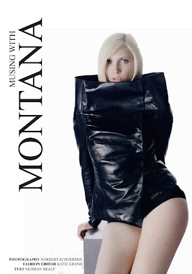
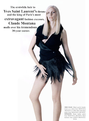
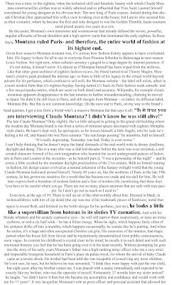
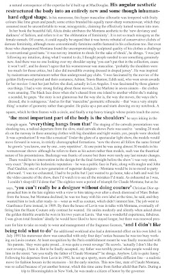

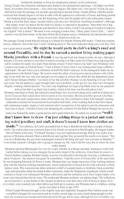
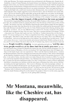
Although this layout is minimalistic which is the look i was going for I feel it could cope with being more busy, capturing more aspects of Montanas work and featuring columns rather than block text. It is overwhelming for the reader which is something I wanted to avoid. when i say overwhelming i mean the text overpowers the text and draws away from the pictures which should be the real focus.
The title was originally at the top of the page, i moved this about into various positions but preferred it at the side as it didn't distract from the main image. I also prefer the font to the original magazine font as it is easier to read and also doesn't distract.here it is in basic times new roman but it demonstrates that a plainer font works. In an attempt to break up the text I highlighted key quotes. This would attract the reader to an article if they read something of interest hat stood out drawing them into the whole article if the pictures weren't enough. Although i like this idea i feel it doesnt work well with the blocks of text. It helps but it still doesnt work.


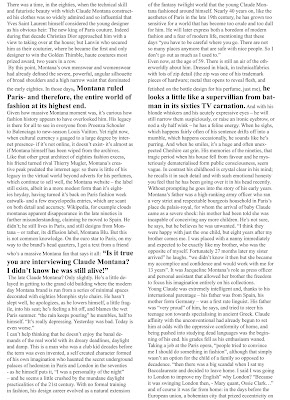
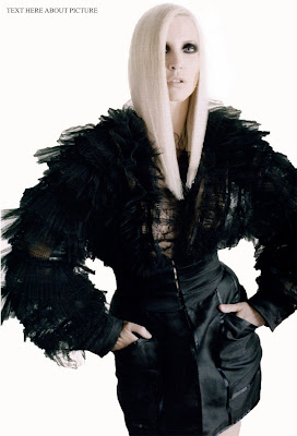
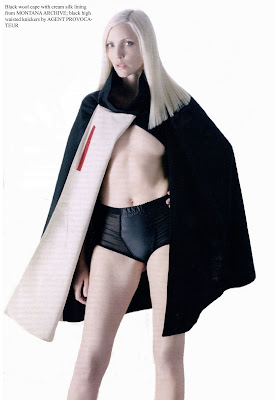
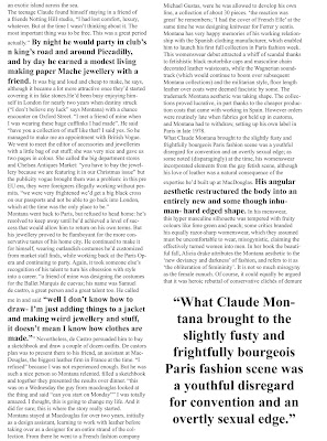
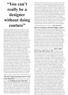
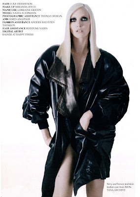
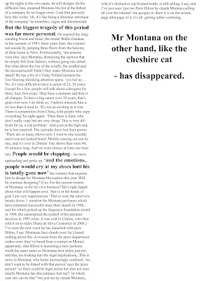
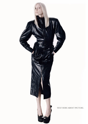
This version is much more appealing to read after a simple change in the structure of the text. It needs touching up slightly and one moe image adding but overall I am pleased with the way this has turned out.
No comments:
Post a Comment